
MyCareHub
On March 1, 2020, the U.S. state of Florida officially reported its first two COVID-19 cases. From there, Covid exploded across the USA and telehealth exploded. It is now an integrated part in medicine that is here to stay. With the guidance of my mentor, I was the designer of the application. I aimed to make the telehealth visit experience simple and easy
Goal
Streamlining the process of joining telehealth appointments through user-centered design.
Finding stressors and improving them in the telehealth system
Make the application intuitive and easy to navigate
Improving communication and keeping patients informed on pricing and wait times
Role
As a UX/UI student researcher I,
Conducted user interview
Synizied pain points into actionable insight
Created personas in user maps
Improved app usability and user trust
Users
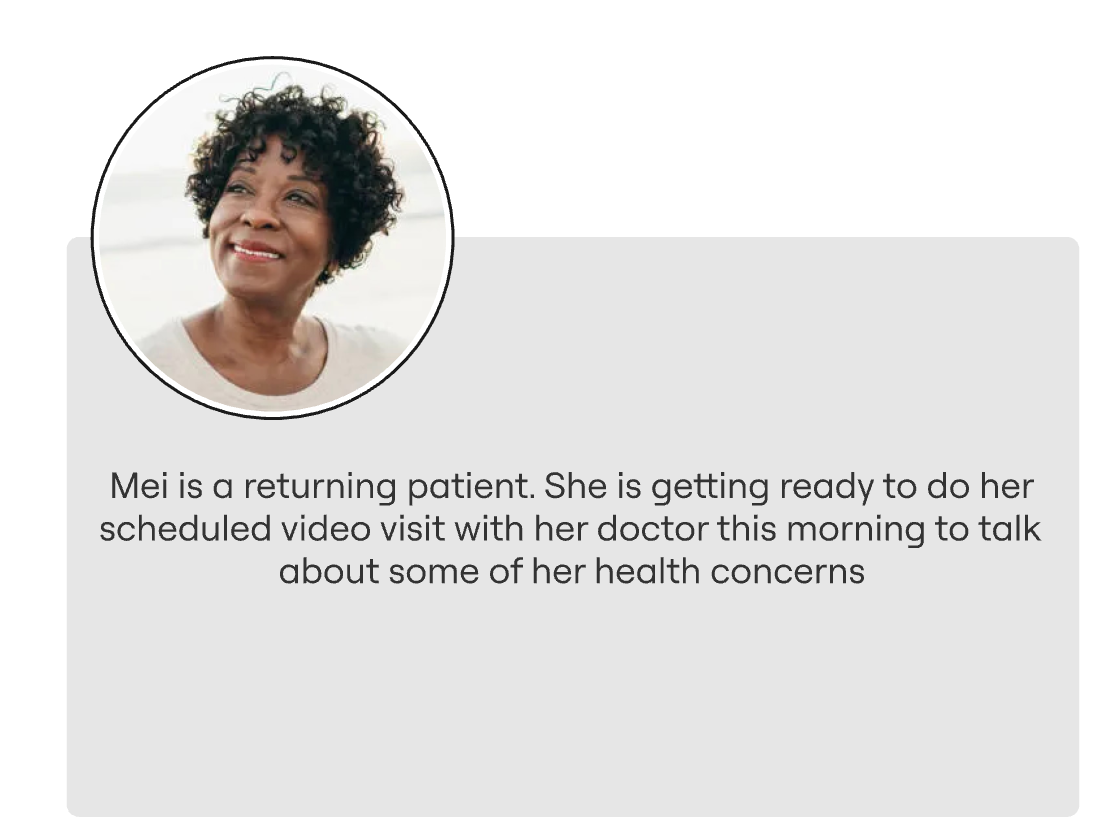
Patients accessing the patient portal for video visits
Patients seeking timely care for non-emergency medical issues through Express Care
Healthcare providers and support staff supporting virtual care
Scope
Log in and securely access their accounts
Join video visits
Access Express Care for non-emergency, on-demand medical needs
Communicate with providers via the mobile app
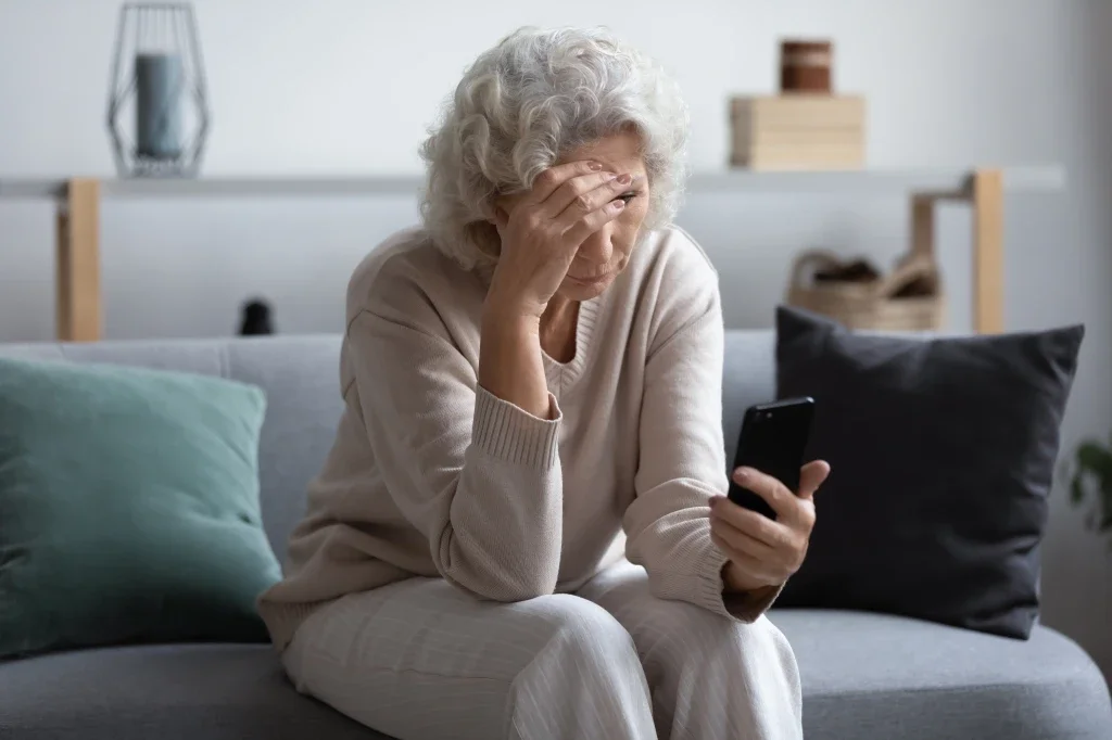
What Happened?
Insights from Patient Portal Users
To get a better idea of how people felt about their patient portals, I sent out a screener looking for people that have a patient portal and have done telehealth before. Preferably people that were 50+ then did 4 user interviews via in-person / zoom.


Defining the Experience
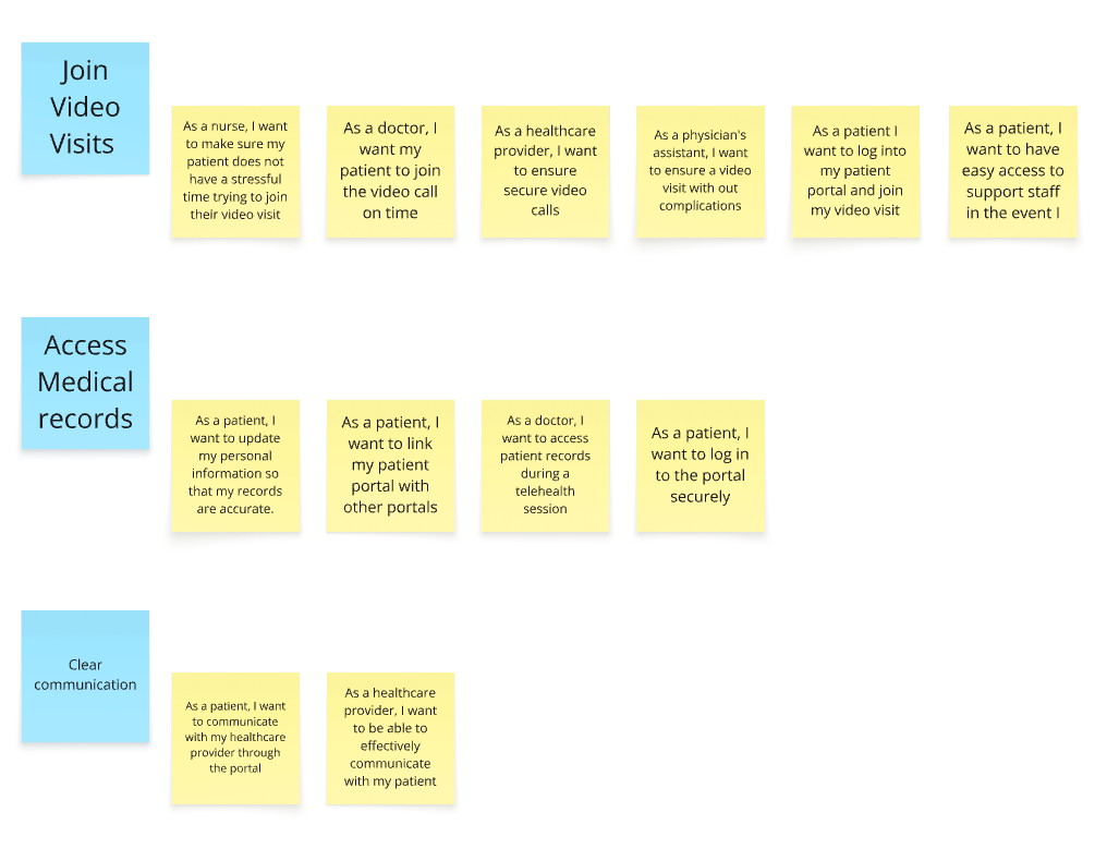
After digging into user research, I mapped out key user stories to better understand priorities and structure the experience more clearly.
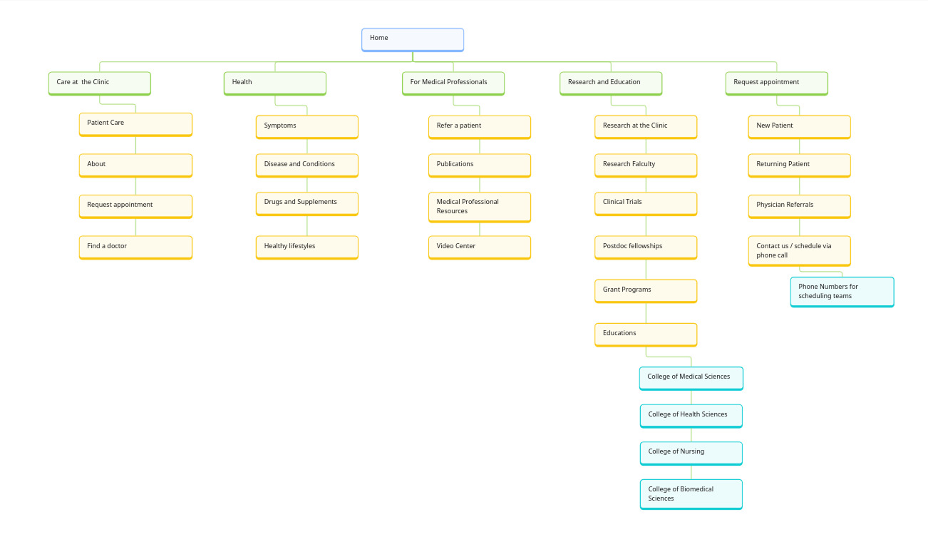
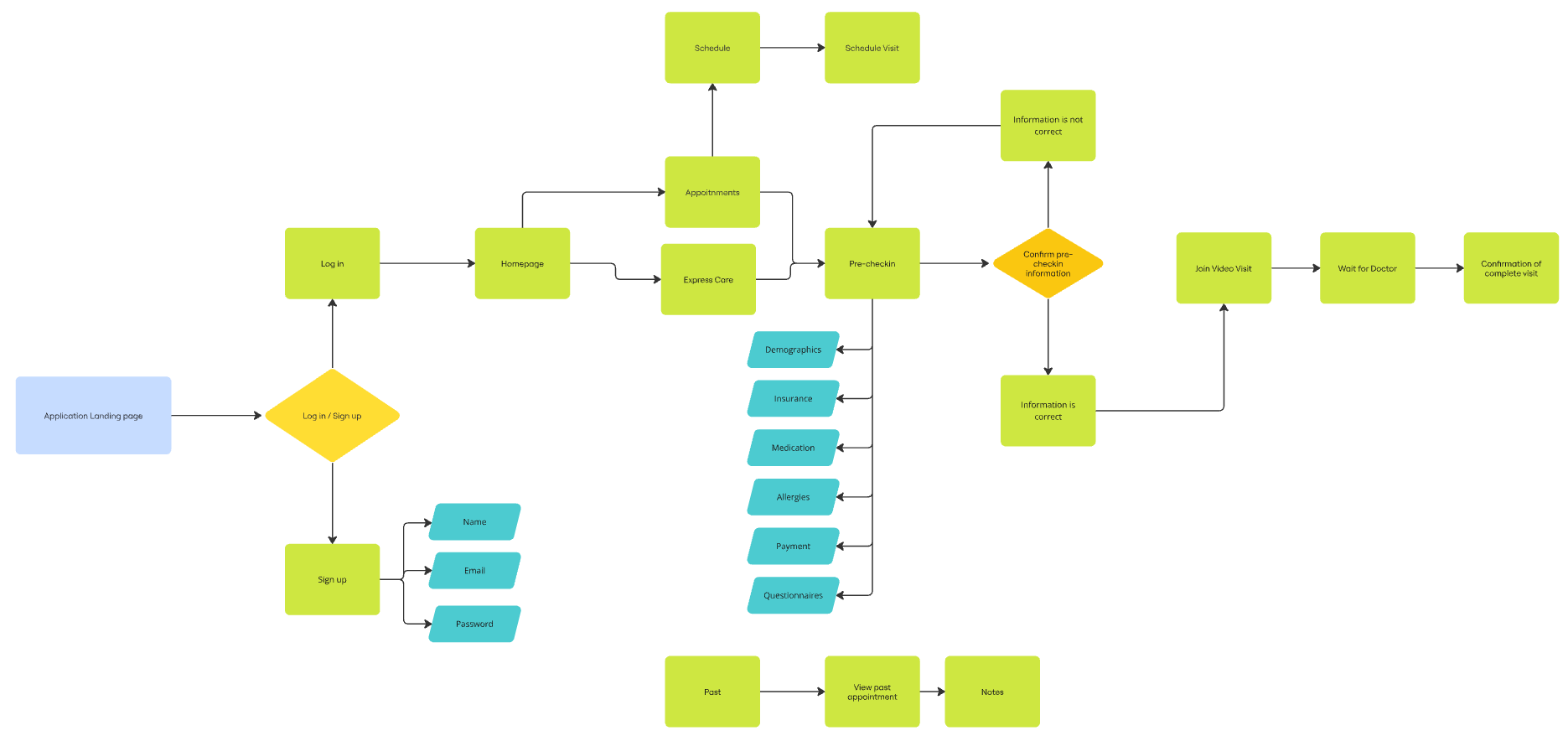
Site Map
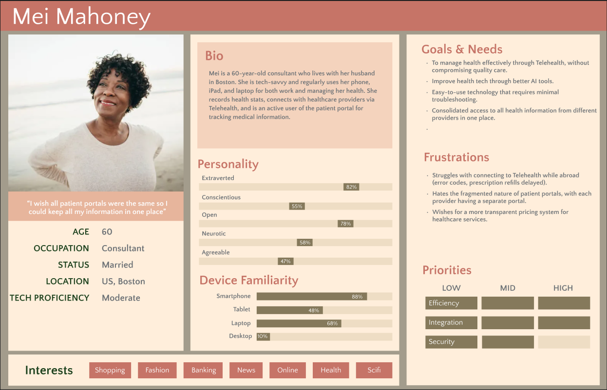
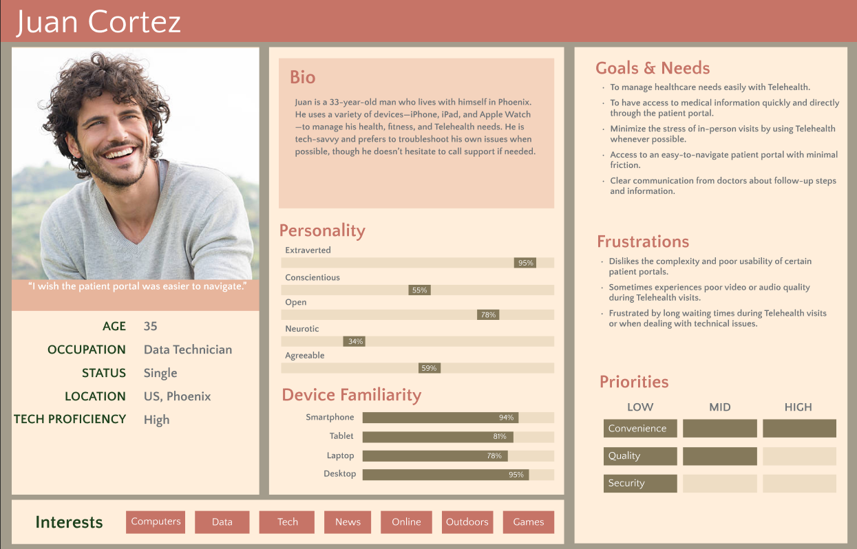
Personas


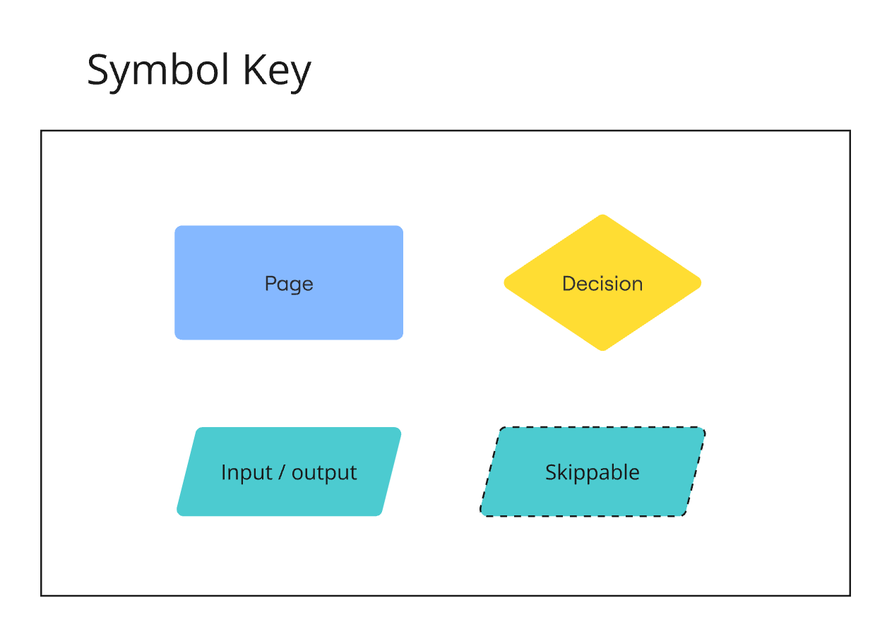
Flow Chart
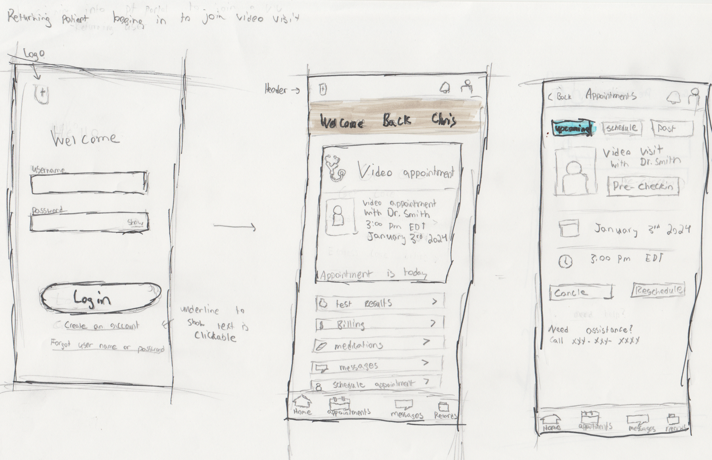
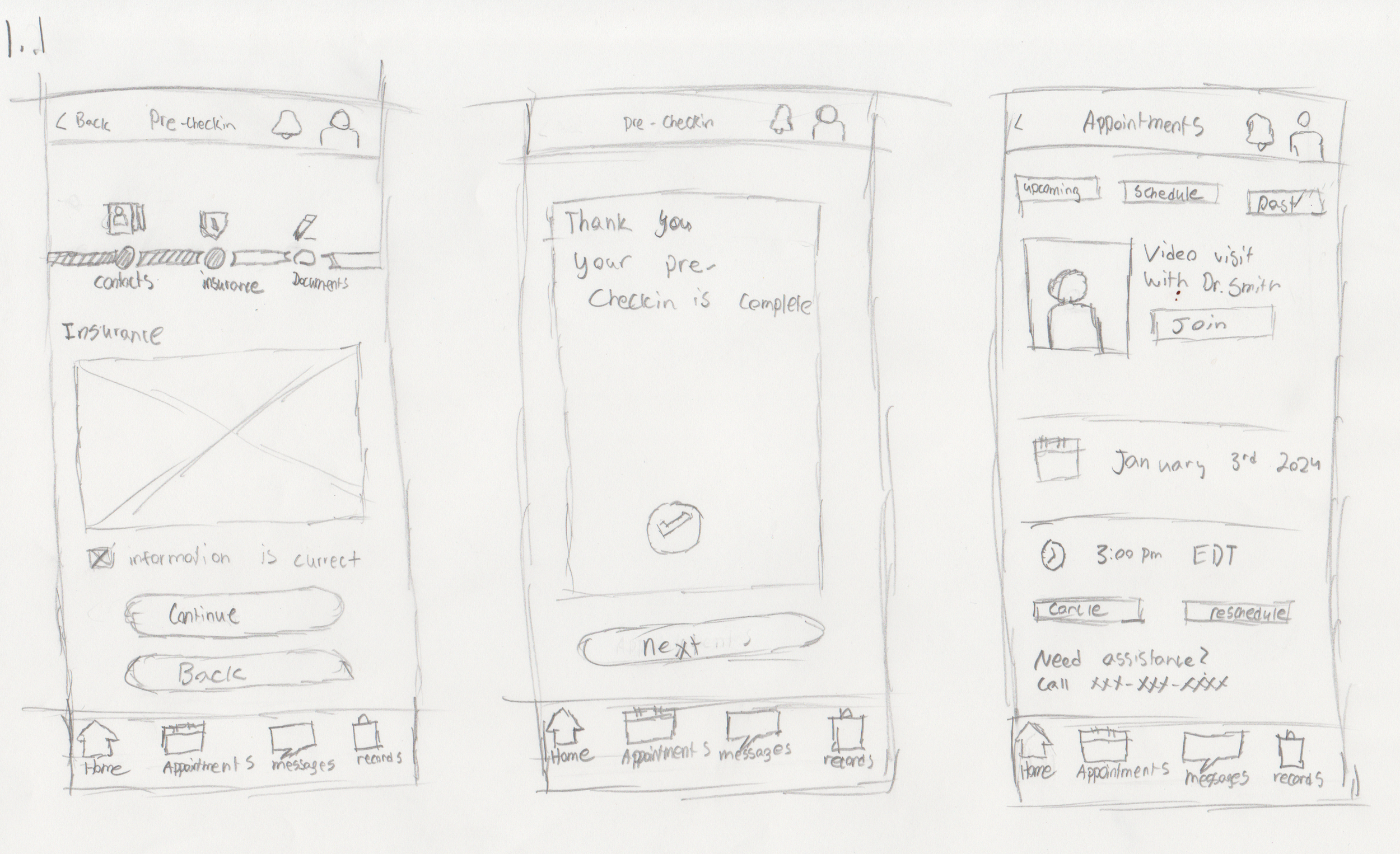
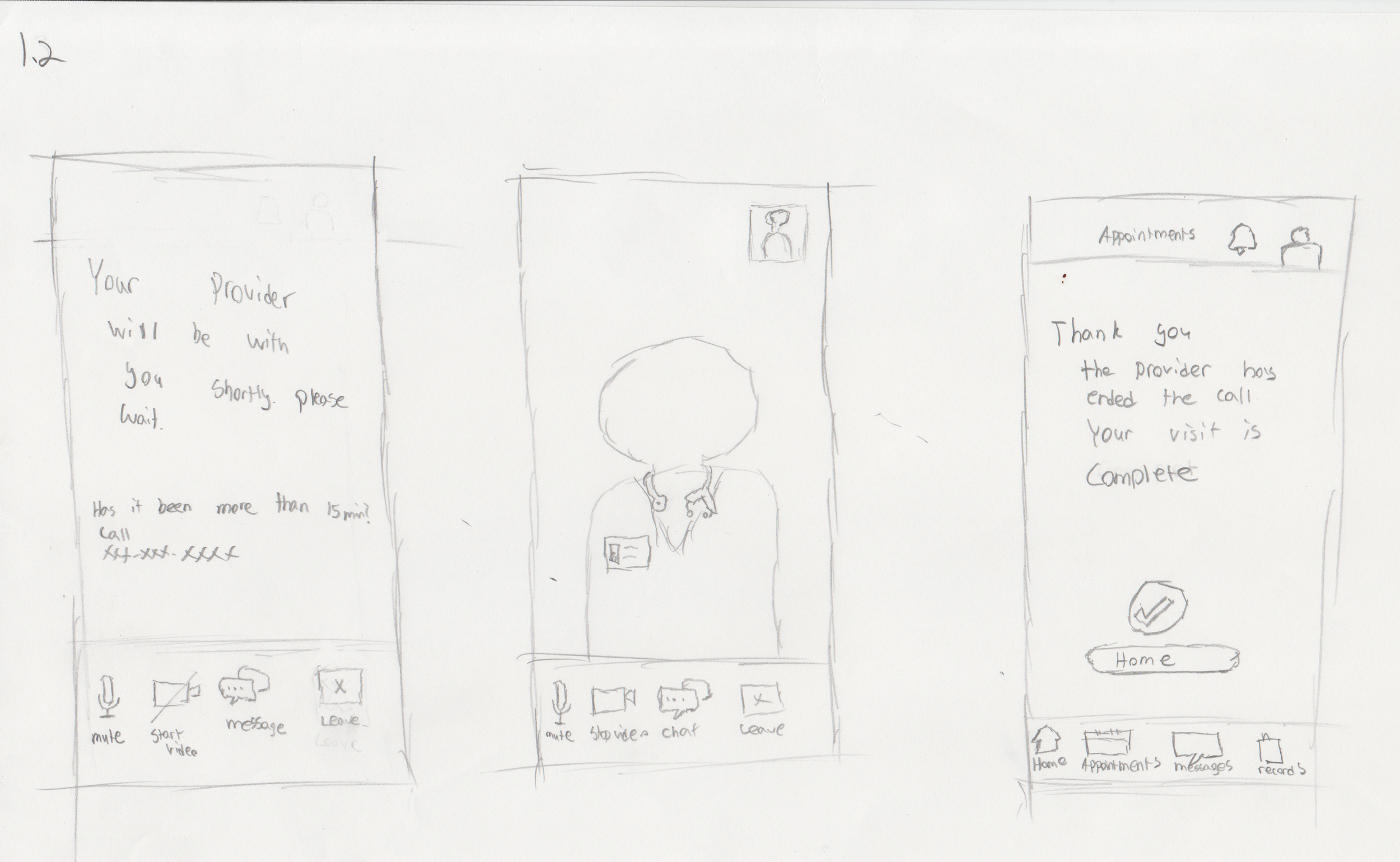
Sketches
Wireflow
Video Visit wireFlow
Scheduled care experience with pre-check, onboarding, and connection
Express Care wireflow
Real-time care access from eligibility to provider follow-up
First iteration
After designing our initial flows, I conducted usability testing to evaluate the red routes and assess ease of use.
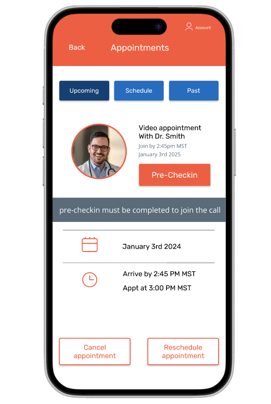
Video Visit Flow
Scheduled care experience with pre-check, onboarding, and connection
Express Care flow
Real-time care access from eligibility to provider follow-up
First Round of Interviews
Insight from first round research
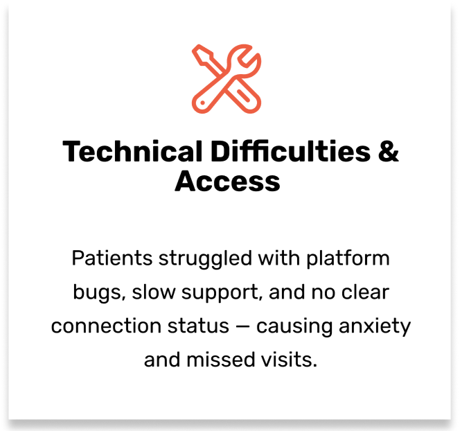
Users liked the step-by-step precheck-in but users overlooked the bar
Participants confused Express Care with scheduled video visits. Unsure where cost info was located. Most looked in Billing.
Ambiguous buttons created hesitation; small tap areas caused missed clicks.
Mismatched icons caused confusion for users
Text was readable, but labels like “Back” were misleading; some buttons too small.
Design Action
Increased the size of the progress bar to make it more noticiable.
Visually differentiate visit types. Show cost + response time upfront in the Express Care flow.
Use explicit labels. Enlarge tap targets. Remove redundant navigation.
Replaced mismatched icons with the correct ones
Replace with action labels (“Confirm,” “Submit”). Increase size/spacing of interactive elements. Follow WCAG accessibility standards.
Key UI Changes
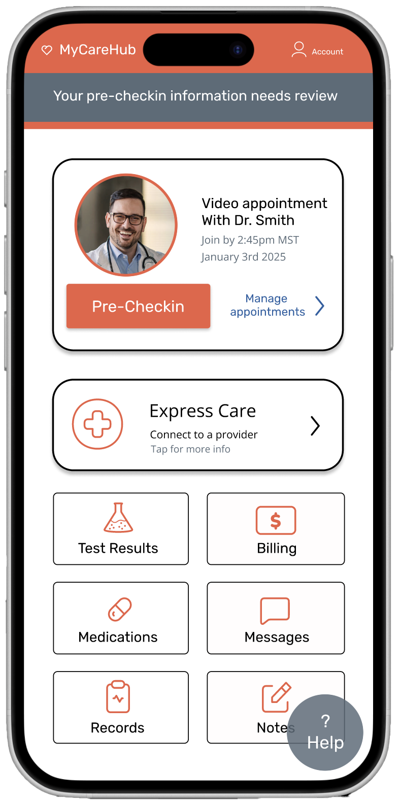
Improved express care visibility of express care and appointments
First Iteration
Second Iteration

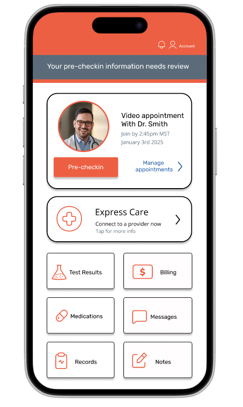

Clearer cancel and reschedule labels

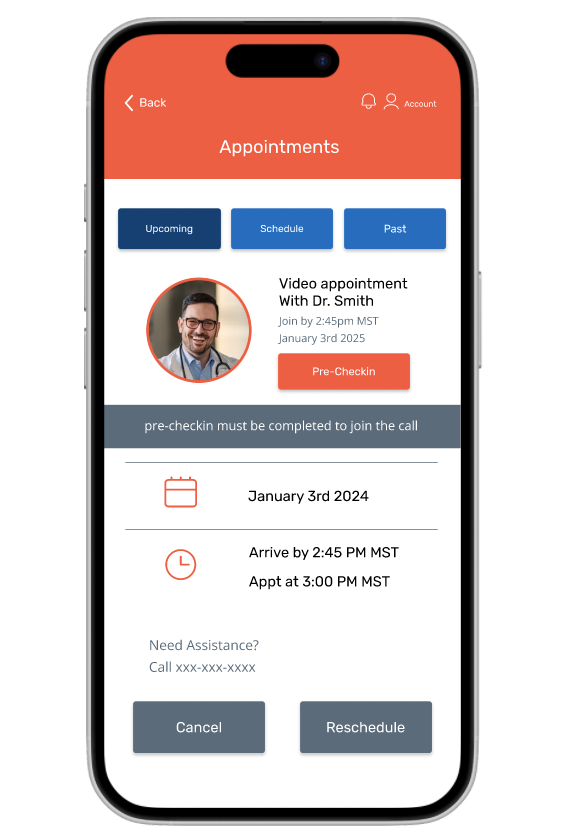
Improved progress tracking and icon clarity


Back button and complete clarity


Enhanced readability of express care info


Second iteration
After our pages were complete I got participants to go through the red routes and test its ease of use
Video Visit Flow
Scheduled care experience with pre-check, onboarding, and connection
Express Care flow
Real-time care access from eligibility to provider follow-up
Future UI Iterations

Further Improve Visuals, text size and text hierarchy
Add a floating help button for quick access
Conclusion
This project pushed me to design with empathy and purpose. By grounding the work in real user stories, I uncovered barriers in telehealth that are often overlooked—like digital anxiety, unclear communication, and accessibility challenges.
Through user interviews, iterative flows, wireframes, and high-fidelity testing, I aimed to create a more intuitive experience for patients navigating video visits and express care. The goal wasn’t just a cleaner interface—it was helping people feel more confident, less stressed, and better supported throughout their care journey.
More than anything, this process reminded me that thoughtful design isn’t just about pixels—it’s about building trust and making technology feel a little more human.